Design Overhall
Update and
time management
As mentioned at the end of the Level Design section, I opted to take a week break for my health and to avoid burn-out and ensure the quality of the product remains stable. Whilst it was difficult to step-back at first, I feel considerably better and ready to jump right back in with a fresh mindset. However, this break comes with the understanding of using up a week of development time. Referring to the proposal document, as of writing this, the second round of primary research was originally scheduled, due to no changes being made since the first playtest and the second test being mainly focused on visuals and audio, it would be redundant to do again at this moment. Instead, two more weeks will be allocated to audio and visual design, and whilst this will leave the second test very late, it should hopefully still leave time for any emergency bug fixing or further development of feedback. And besides, if the design over hall is finished early, the second testing can be moved up again, and further development on the game can be made during the playtesting to ensure maximum efficiency of development.
Enemies
The enemy designs themselves are mainly direct adaptations of their design sheets seen earlier in development. As seen in Figures 1, 2, and 3, they all look amazing and are exactly what I would’ve hoped for when compared to the original designs.


Figure 1 - Sketch of The Felled Design (Left) and Final Model of The Felled (Right) (Replacing Zombies)


Figure 2 - Sketch of Eye Of Satan Design (Left) and Final Model of Eye Of Satan (Right) (Replacing Bats)


Figure 3 - Sketch of The Screecher Design (Left) and Final Model of Screecher (Right) (Replacing Spiders)
As mentioned during the first playtest, the enemies will provide further feedback upon getting hit. Whilst adding the particles and sound itself was simple, there was a further issue with both not occurring on the killing blow, due to the enemy automatically deleting itself alongside the particle and sound system. To remedy this, instead of immediately deleting itself, it will deactivate many of its components, disabling all interactions, as seen in Figure 4. After which it will wait for a few seconds, long enough for the particles and sounds to play, before ultimately deleting itself. With the final result seen in Figure 5.

Figure 4 - Code behind disabling enemy
Figure 5 - Demonstration of Enemy hit sound and particle effects
Heads up display
Addressing another issue vented in the playtest that had already been planned, was players not being fully aware of when they were taking damage, shown in Figure 8, with most testers requesting some form of indicated to damage besides a change in health or a clearer representation of health within the UI design. Figure 9 showcases a simple flash effect that was added around the players screen to convey when damaged, similar to how games like Overwatch (2016) display a damaged effect around your screen when low on health, Seen in Figure 10.

Figure 8 - Feedback on clarity of damage

Figure 9 - Damaged visual in-game

Figure 10 - Similar damage effect in Overwatch (2016)
Secret Characters
As you may have noted, the models for the 4 secret characters have existed for a while now. However, they always remained unemotive due to the static nature of the voxel models. One solution was to rig up the models in a 3D modelling software like Blender (2019), although learning a new software from scratch in the later stage of development could potentially waste valuable time with not much to show for. Instead, each piece of the models were exported individually and later reconstructed within Unity, shown in Figure 6. Each part of the model had to be placed within its own empty game object and positioned in correlation to it, allowing for each element to be correctly rigged, as seen in Figure 7. Whilst this works, it’s a tedious process, however its satisfactory and doesn’t create much of an issue as it only needs to be done for 4 characters, all of whom can be seen in Figure 8.

Figure 6 - Each part of the Marigold model separated before exporting to Unity
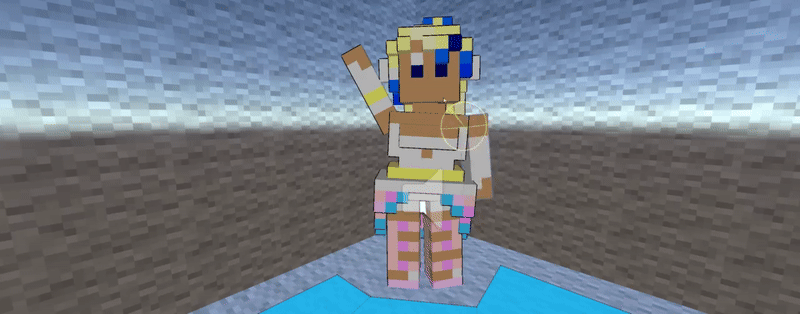
Figure 7 - Demonstration of Marigold rigged in Unity


Figure 8 - All secret character models
Logo
A personal favourite part of every project is creating a game logo, and whilst it isn’t vital, a logo can cement the recognisability and memorability of a game (Cooper, 2024) and may serve as the first impression a player has of a game (Creative Bits Team, 2023). A few initial ideas were ran through, As seen in figure 11. Originally the design was sharper and rougher, but experimenting with different fonts led to Megarok by Chequered Ink (2018), which worked incredibly well for the logo design, so much that it was chosen as the common font to be used throughout most in-game UI. Whilst the initial version looked good, it lacked any element that made it sickout as a logo. Taking inspiration from the logo design of Alan Wake (2010), seen in Figure 12, a vague silhouette of the character was added to the final logo, seen in Figure 13, alongside a reference to the amulet that serves as an important plot point.

Figure 12 - Alan Wake (2010) Logo

Figure 11 - Sketches for logo ideas

Figure 13 - Final MMiH HALO WARS logo
UI
As seen in Figure 14, the original sketches of the UI were inspired by recurring in-game visuals, such as the dark-brick interior, the hell-stone caves or the purple pillars. This consistency of theming will further bring the whole game together, and having multiple designs for the buttons can allow for a variety in buttons shapes and highlight more important features, seen in Figure 15.


Figure 14 - Sketches for buttons and other early UI Design.

Figure 15 - Finalised design for home screen UI and Buttons
The design for the Archive UI was more accidental, originally each element of the archive was to have its own separate design, as seen in Figure 16. Being inspired by ancient scrolls, lodestones, and ripped out pieces of paper, all to invoke a more hand-made feeling to fit the continuity of the lore. However, this version was considerably overdesigned and looked messier then appealing. Experimenting with other designs led to utilising the scroll design as the whole archive, which ended up looking amazing, and was left as the final version, Seen in Figure 17.

Figure 16 - Early sketch of Archive UI

Figure 17 - Final Design of Archive UI
Sound design and voice acting
As stated in the design section, sound design has always been a neglected part of my projects. And whilst this time more thought was put in, it was once again left to last minute. In retrospect, planning to creating music despite having no prior music or sound design experience was fairly ambitious. This wasn’t too much of a pivot, especially since time is running out it made for more realistic goals to take sounds from elsewhere. Besides common sound effects, voice acting was another major point which required input from many volunteers. Volunteers weren’t hard to come by, and putting a call-to-action on social media showed how eager people were to voice act. One issue is the variety of audio qualities, its often quite jarring when a character speaks, though ensuring every line of dialogue is recorded under the same circumstances and to a similar quality is a momentous task. Regardless of quality, it goes without saying that the cast was incredibly talented and helped to bring the whole game together, as seen in Figure 18.
Figure 18 - Voice acting and sound effect demonstration
Concluding design overhall

Figure 19 - ClickUp board after end of Design Over hall stage
Look at the ClickUp board seen in Figure 19, there was still some work left to be done that couldn’t be done due to dwindling time, especially in reference to level decoration. The level feels considerably more baron and lifeless than the original sketches proposed, exampled in Figure 20. However, not much can be done as this is just an unfortunate side effect of having limited time to develop a project, thought it'd serve as a priority given further development.


